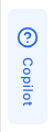
Edge Trigger
The edge trigger is a slim vertical tab that appears on the screen edge and opens the help panel when clicked.
Basic Configuration
examples/guides/edge-trigger/basic-config.tsx
<PillarProviderproductKey="..."publicKey="..."config={{edgeTrigger: {enabled: true,},}}>
Options Reference
| Option | Type | Default | Description |
|---|---|---|---|
enabled | boolean | true | Show/hide the edge trigger |
Position
The edge trigger position follows the panel position. If the panel is on the right, the trigger appears on the right edge of the screen.
examples/guides/edge-trigger/panel-position.tsx
config={{panel: {position: 'right', // Trigger will be on the right edge},}}
Disable the Trigger
Hide the edge trigger and control the panel with your own custom button:
examples/guides/edge-trigger/disable-trigger.tsx
<PillarProviderconfig={{edgeTrigger: {enabled: false,},}}><CustomHelpButton /></PillarProvider>
Then use the usePillar hook to control the panel:
examples/guides/edge-trigger/custom-help-button.tsx
function CustomHelpButton() {const { open, close, toggle, isPanelOpen } = usePillar();return (<button onClick={toggle}>{isPanelOpen ? 'Close' : 'Help'}</button>);}
Behavior
The edge trigger:
- Shows sidebar tabs configured via
sidebarTabs - Stays visible when the panel opens (shifts with the panel)
- Reserves space in the layout (push mode)
- Automatically syncs with your app's theme (light/dark)