Text Selection Helper
The text selection feature shows a popover when users select text on your page. This provides a quick way to get help about specific content without opening the panel first.
How It Works
- User selects text anywhere on your page
- A help button appears near the selection:
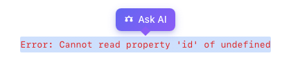
- User clicks the button
- Panel opens with the selected text as context:
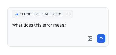
- The co-pilot responds with relevant help using the highlighted text as context
Enable Text Selection
examples/guides/text-selection/enable-text-selection.tsx
import { PillarProvider } from '@pillar-ai/react';function App() {return (<PillarProviderproductKey="your-product-key"publicKey="pk_live_xxx"textSelection={{enabled: true,label: 'Ask co-pilot',}}><YourApp /></PillarProvider>);}
Configuration Options
| Option | Type | Default | Description |
|---|---|---|---|
enabled | boolean | false | Enable the text selection popover |
label | string | 'Ask co-pilot' | Button label text |
Runtime Control
Enable or disable text selection programmatically:
examples/guides/text-selection/runtime-control.tsx
import { usePillar } from '@pillar-ai/react';function SettingsPage() {const { pillar } = usePillar();const handleToggle = (enabled: boolean) => {pillar?.setTextSelectionEnabled(enabled);};return (<label><inputtype="checkbox"defaultCheckedonChange={(e) => handleToggle(e.target.checked)}/>Enable text selection helper</label>);}
Use Cases
Error Messages
Users can select an error message and ask "What does this mean?" or "How do I fix this?"
Documentation
Highlight confusing terms or concepts to get instant explanations.
Code Snippets
Select code examples and ask for clarification or alternatives.
Best Practices
Disable in Editors
If your app has rich text editors, disable text selection to avoid interfering with the editor's selection behavior:
examples/guides/text-selection/disable-in-editors.tsx
function EditorPage() {const { pillar } = usePillar();useEffect(() => {pillar?.setTextSelectionEnabled(false);return () => pillar?.setTextSelectionEnabled(true);}, [pillar]);return <RichTextEditor />;}
Keep Labels Short
The popover appears near the selection, so keep the label concise:
examples/guides/text-selection/label-examples.tsx
// Goodlabel: 'Ask co-pilot'label: 'Help'label: 'Explain'// Too longlabel: 'Ask the co-pilot about this text'